
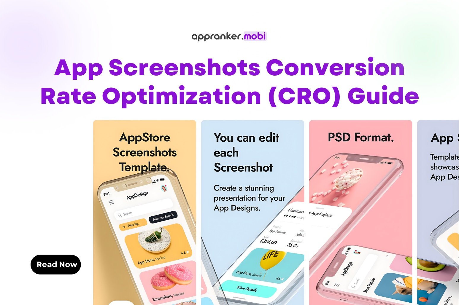

App Screenshots Conversion Rate Optimization (CRO) Guide
App store page is only half the job.
The real question is: why do some users install your app while others leave without taking action?
In most cases, the answer comes down to screenshots.
App screenshots are one of the strongest conversion levers in App Store Optimization. They don’t just decorate your listing — they explain, convince, and remove doubt. When screenshots are done right, they can dramatically improve your conversion rate optimization (CRO) without increasing traffic or ad spend.
This article explains how app screenshots improve CRO, why they work, and how to optimize them properly.
Why App Screenshots Matter More Than You Think
Most users don’t read your app description.
They skim.
What they do look at carefully:
-
App icon
-
App name
-
First 2–3 screenshots
In fact, many install decisions are made before a user scrolls past the screenshots section.
If your screenshots fail to communicate value quickly, users bounce — even if your app ranks well.
That’s why screenshots are not a design task.
They are a conversion strategy.
How Screenshots Directly Impact Conversion Rate
1. Screenshots Explain the App Faster Than Text
Users don’t want to “figure out” your app.
Good screenshots instantly answer:
-
What does this app do?
-
Who is it for?
-
Why should I install it?
A strong first screenshot alone can outperform a long description.
If users understand your value in 3 seconds, conversion goes up.
2. They Reduce Uncertainty and Risk
Installing an app feels small — but it still carries friction:
-
Will this app work?
-
Is it worth my time?
-
Is it confusing?
Screenshots reduce that friction by showing:
-
Real UI
-
Real features
-
Real use cases
When users see how the app works, they trust it more.
More trust = higher install rate.
3. Screenshots Set the Right Expectations
Bad conversions often lead to bad retention.
When screenshots accurately represent:
-
App flow
-
Core features
-
Limitations
Users install with realistic expectations.
This improves:
-
Install-to-open rate
-
Early retention
-
Review quality
CRO is not just about installs — it’s about the right installs.
The Role of Screenshot Order in CRO
Not all screenshots matter equally.
Screenshot #1: The Deal Breaker
Your first screenshot is the most important asset on your listing.
It should:
-
Highlight the main benefit (not features)
-
Use clear, readable text
-
Speak to a specific user problem
Bad example:
“All-in-one AI-powered solution”
Better example:
“Track your expenses automatically in seconds”
If screenshot #1 fails, users won’t scroll.
Screenshot #2–3: Proof and Context
These screenshots should:
-
Show how the app works
-
Reinforce the core benefit
-
Address common objections
This is where users decide:
“Okay, this is for me.”
Later Screenshots: Depth, Not Noise
Screenshots after #3 support:
-
Advanced features
-
Secondary use cases
-
Social proof or credibility
They matter — but only if users reach them.
Why Text on Screenshots Is Critical for CRO
Many apps rely only on UI images.
That’s a mistake.
UI alone doesn’t explain why something matters.
High-converting screenshots combine:
-
UI visuals
-
Short, bold text overlays
-
Clear benefit-driven messaging
Rules that work:
-
One message per screenshot
-
4–6 words max for text
-
Large, readable font
-
High contrast
If users have to zoom or guess, CRO drops.
App Screenshots vs App Description (CRO Reality)
Let’s be honest.
If screenshots are weak:
-
A great description won’t save conversions
-
Ads will become expensive
-
Rankings won’t hold
Screenshots do the heavy lifting before users read anything else.
That’s why CRO-focused ASO starts with visuals, not text.
Common Screenshot Mistakes That Hurt CRO
These mistakes quietly kill conversions:
-
Showing too many features at once
-
Using vague marketing phrases
-
Overcrowded UI visuals
-
Small, unreadable text
-
Copying competitor styles blindly
-
Using different messaging on each screenshot
Inconsistent messaging confuses users.
Confused users don’t install.
How to Optimize Screenshots for Better Conversion Rate
1. Start With User Intent
Ask:
-
Why is someone searching for this app?
-
What problem do they want solved now?
Your screenshots should mirror that intent.
2. Focus on Benefits, Not Features
Users don’t care what your app has.
They care:
-
How it helps them
-
How it saves time
-
How it makes life easier
Translate features into outcomes.
3. Test, Don’t Guess
Even small changes matter:
-
Screenshot order
-
Text wording
-
Background color
-
UI angle
A/B testing screenshots often leads to double-digit CRO improvements without changing rankings or traffic.
iOS vs Android: Screenshot CRO Differences
While the principle is the same, behavior differs slightly.
-
iOS users are more sensitive to polish and clarity
-
Android users often scroll more and read deeper
This means:
-
iOS screenshots should communicate faster
-
Android screenshots can support more explanation
Ignoring platform behavior limits CRO potential.
The CRO Feedback Loop You Should Know
Here’s the hidden advantage of good screenshots:
Better screenshots →
Higher conversion rate →
More installs →
Stronger store signals →
Better rankings →
More organic traffic
CRO doesn’t just convert traffic.
It amplifies ASO performance.
Final Takeaway
App screenshots are not decoration.
They are your silent salesperson.
If your app isn’t converting well, don’t rush to ads or keywords first.
Look at your screenshots.
Clear messaging, strong visuals, and honest representation can dramatically improve conversion rate optimization — without increasing traffic or spend.
In ASO, rankings bring users in.
Screenshots decide whether they stay.